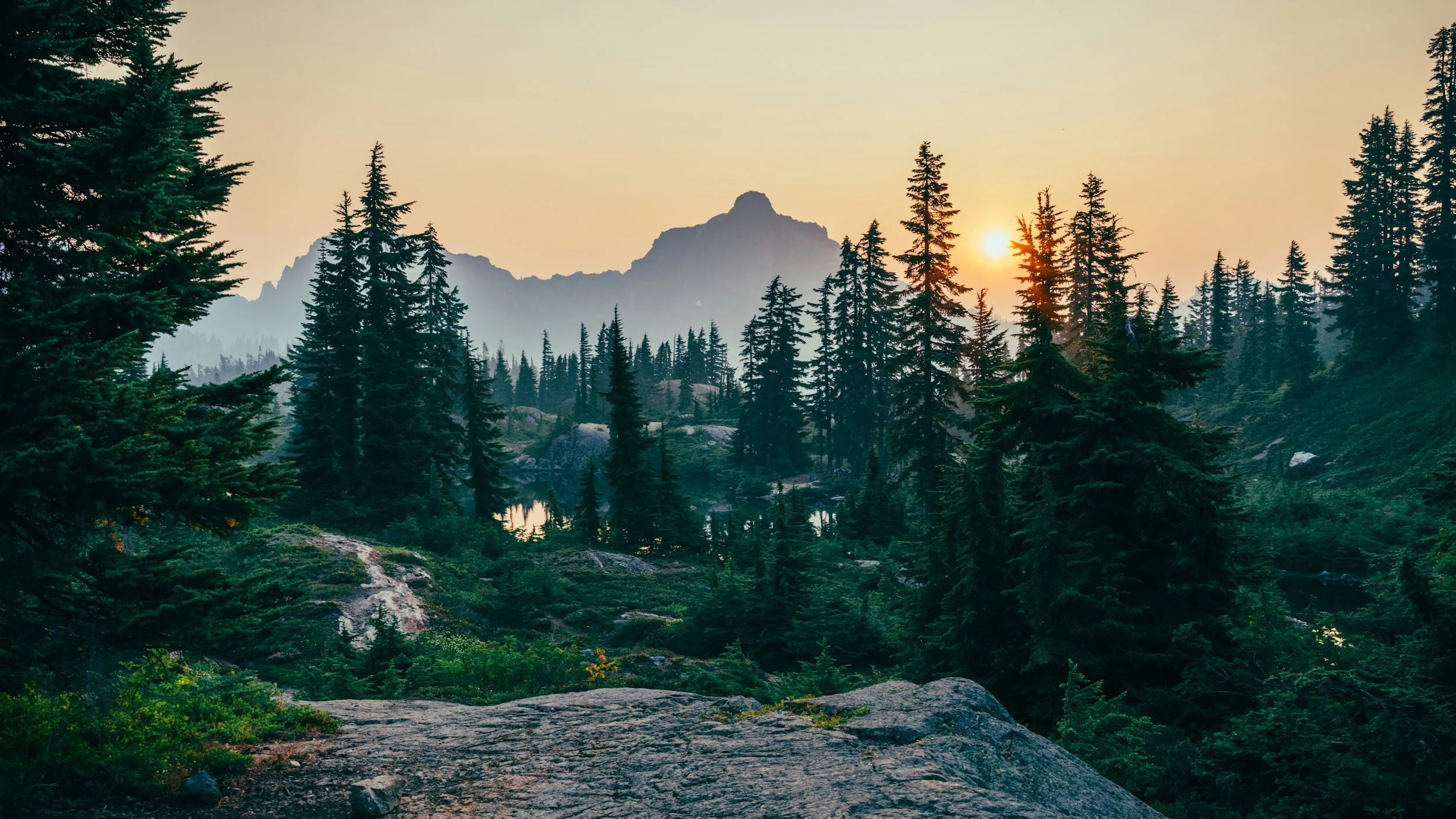

Tahoma is a conceptual outdoor apparel brand inspired by the forests of Mount Rainier, known as "Tahoma" by the Indigenous peoples who have called it home for generations, and by my love for the misty Pacific Northwest.
It blends a rugged, outdoor feel with a deep appreciation for nature, pulling inspiration from my travels and experiences exploring the outdoors. The result is a brand identity inspired by the landscapes of the Pacific Northwest, designed to encourage exploration and a deeper appreciation for the outdoors.
TAHOMA
Conceptual outdoor apparel brand design
Design Goals
Create a cohesive brand identity that captures the rugged beauty and atmosphere of the Pacific Northwest.
Develop custom patterns and visual elements inspired by Mount Rainier's forests, native wildlife, and misty landscapes.
Apply the brand consistently across apparel, packaging, print collateral, and digital touchpoints to create an authentic and immersive outdoor brand experience.
Sensory Profile
Acoustics
Rain pittering on damp forest floor, gravel crackling beneath hiking boots, crackling fire, babbling brook
Texture
Coarse slate, rough bark, waxed canvas, crisp mountain air, soft wool flannel
Scent
Fresh cedar, damp earth after rainfall, smokey campfire, crisp mountain air
Deliverables
Logo and complete brand identity system
Color palette and typography guidelines
Website design and responsive mobile layouts
Email marketing campaign (desktop and mobile)
Custom patterns and iconography inspired by Pacific Northwest forests
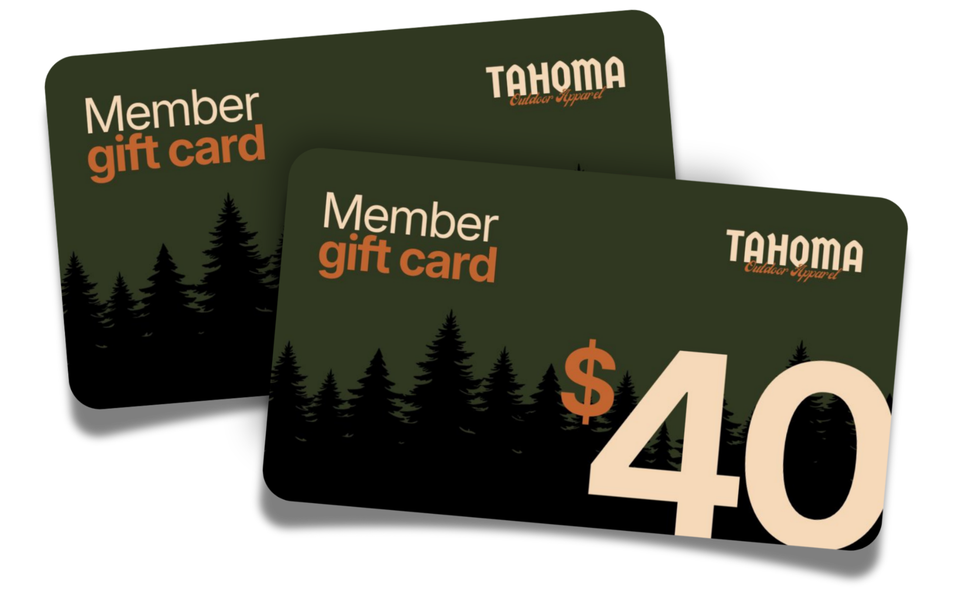
Apparel graphics, product tags, and packaging design
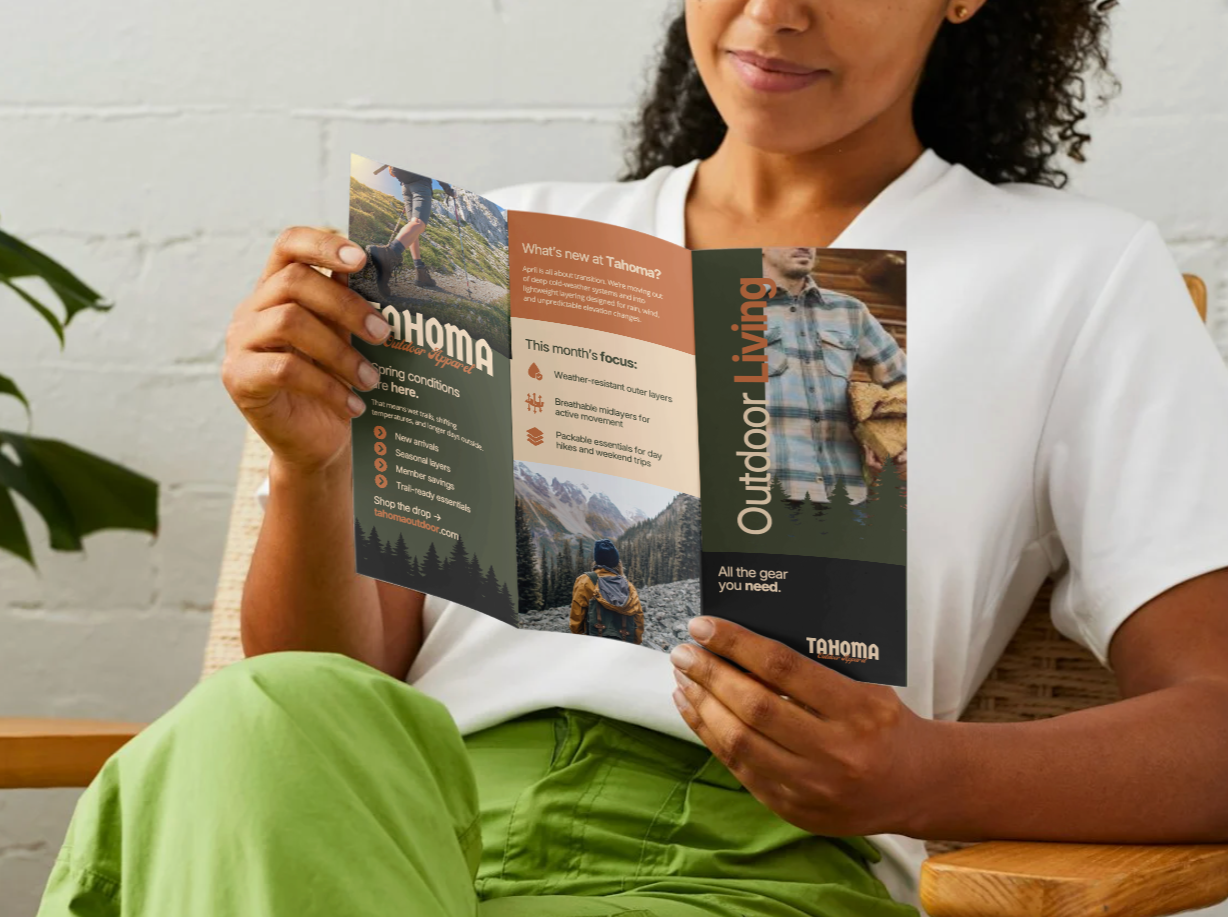
Print and branded collateral (business cards, stickers, postcards, field guide, signage)
Experiential brand mockups showcasing the outdoor lifestyle through retail displays, environmental graphics, and branded merchandise
Tools
Illustrator
Photoshop
Canva

WEBSITE LANDING PAGE DESIGN
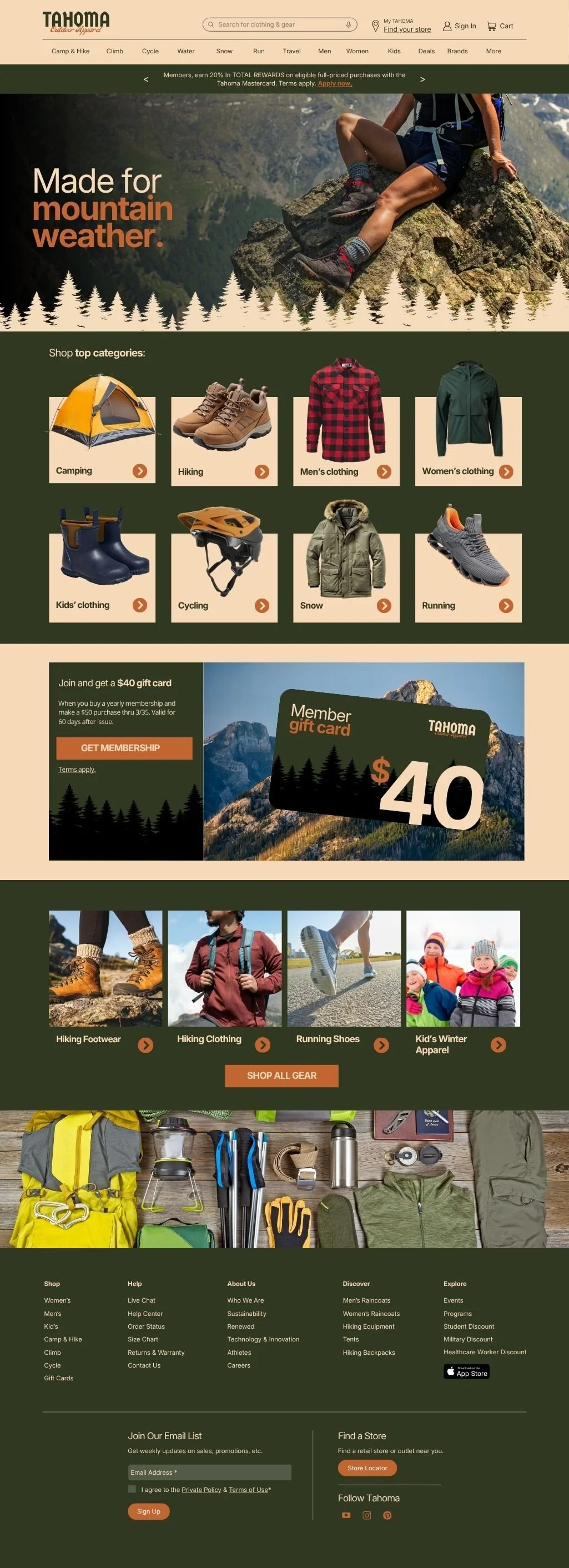
I designed a full e-commerce website home page with a layout that guides users toward product discovery and purchase.
Structured navigation, categories, and product hierarchy reduces friction and supports faster buying decisions.
I used brand-consistent visual storytelling and real, lifestyle imagery to strengthen product appeal.
BRAND GUIDELINES
Pacific Northwest-inspired color palette and patterns influenced by mountain and forest landscapes, ensuring a cohesive and recognizable brand identity.
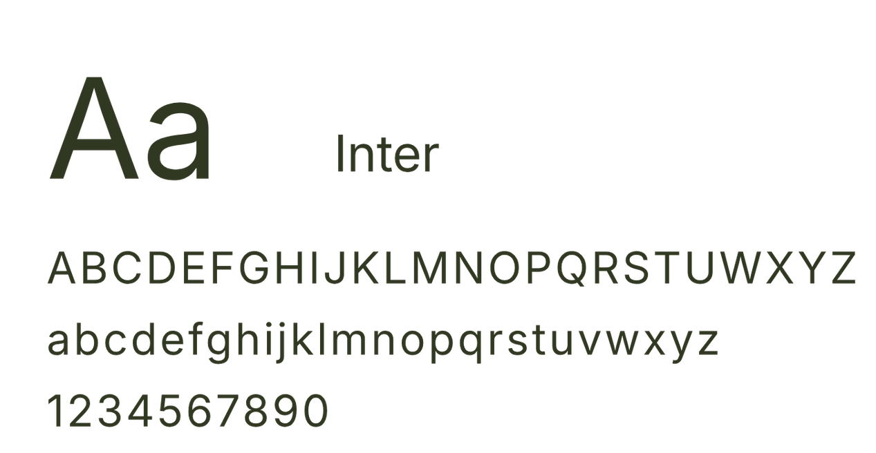
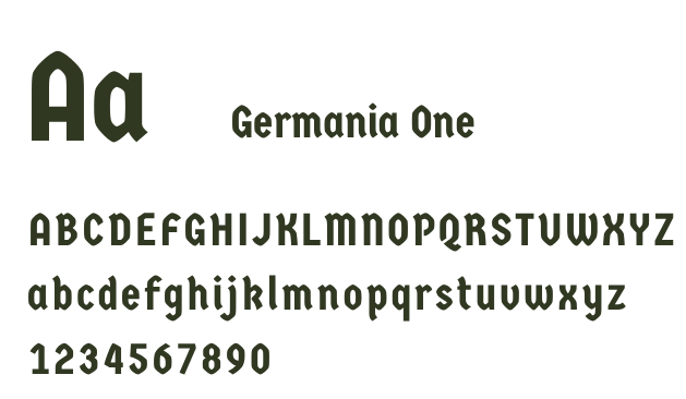
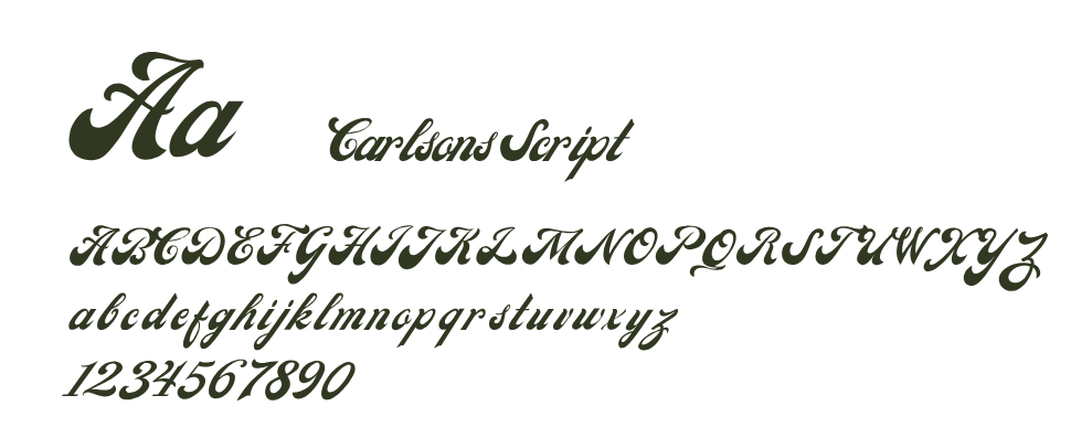
Refined logo and typography system mixing a retro-feel with modern simplicity to create a contemporary outdoor apparel brand.
Immersive, lifestyle-driven visual language that strengthens brand recognition and remains versatile across digital and e-commerce applications.
Color Palette
Logo
#121212
Typography
Pattern
#313822
#c36531
#f6d9b8